BOTANIK
– FOOD AND MORE
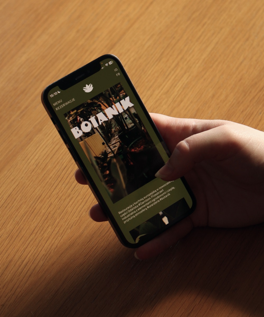
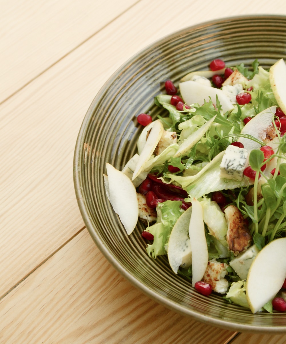
The Botanik restaurant focuses on European flavors, enriched with the chef's signature accents. It is located in the historic part of Wrzeszcz, on the premises of a former military garrison, which was transformed into a modern housing estate. The interior of the restaurant combines industrial elements and refers to the pre-war period, and its main part is located in the orangery. The space is filled with plants, and despite the elegant decor, the place maintains a cozy and intimate atmosphere.
Gdańsk
/
2024
services
visual identification
webdesign
branding
outcome
authors
marta roche managment / branding
konrad roche art direction / graphic design / illustrations
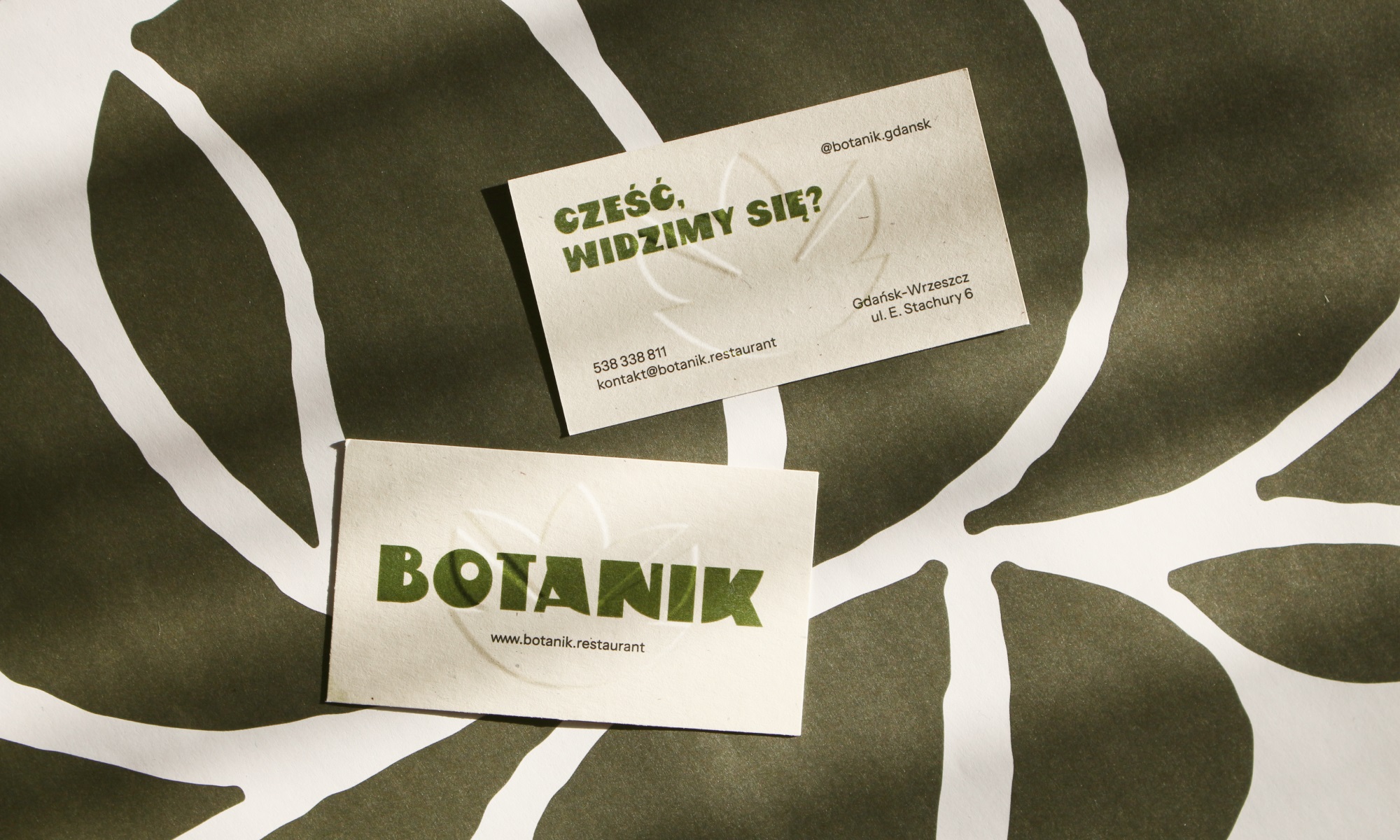
An elegant restaurant that focuses on a cozy atmosphere.
( + ) challenge
We participated in the creation of Botanik from the very beginning. We were introduced to the first decisions and saw the transformation of the place. This was of particular importance because the place had previously also operated as a restaurant - however, the new owner wanted to clearly emphasize that he was creating a completely new place. We could help not only with the visual part, but also with the comprehensive branding of the restaurant's brand.
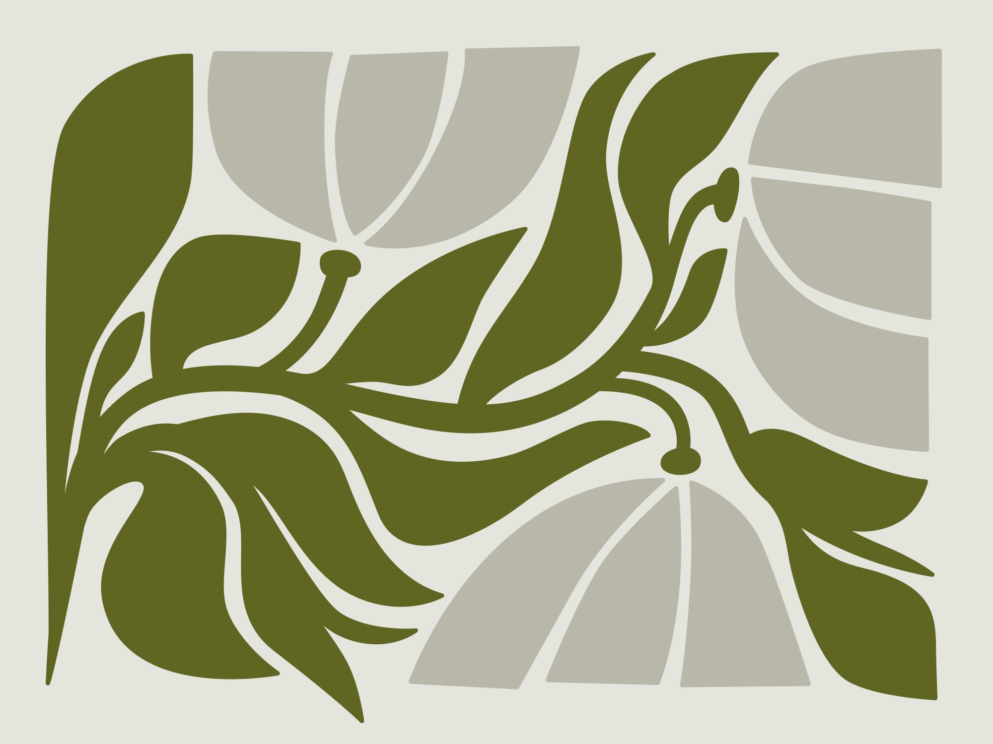
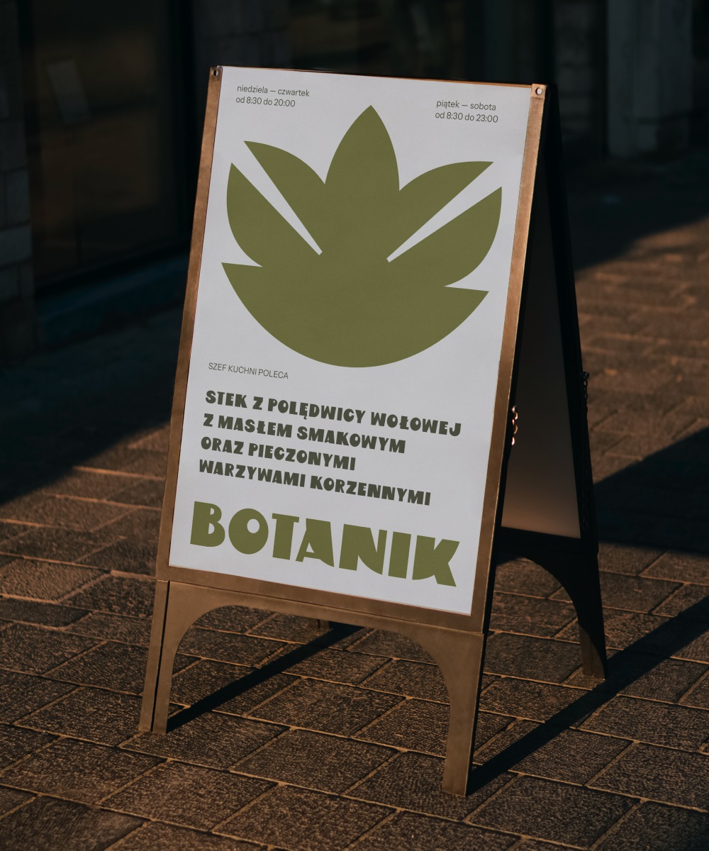
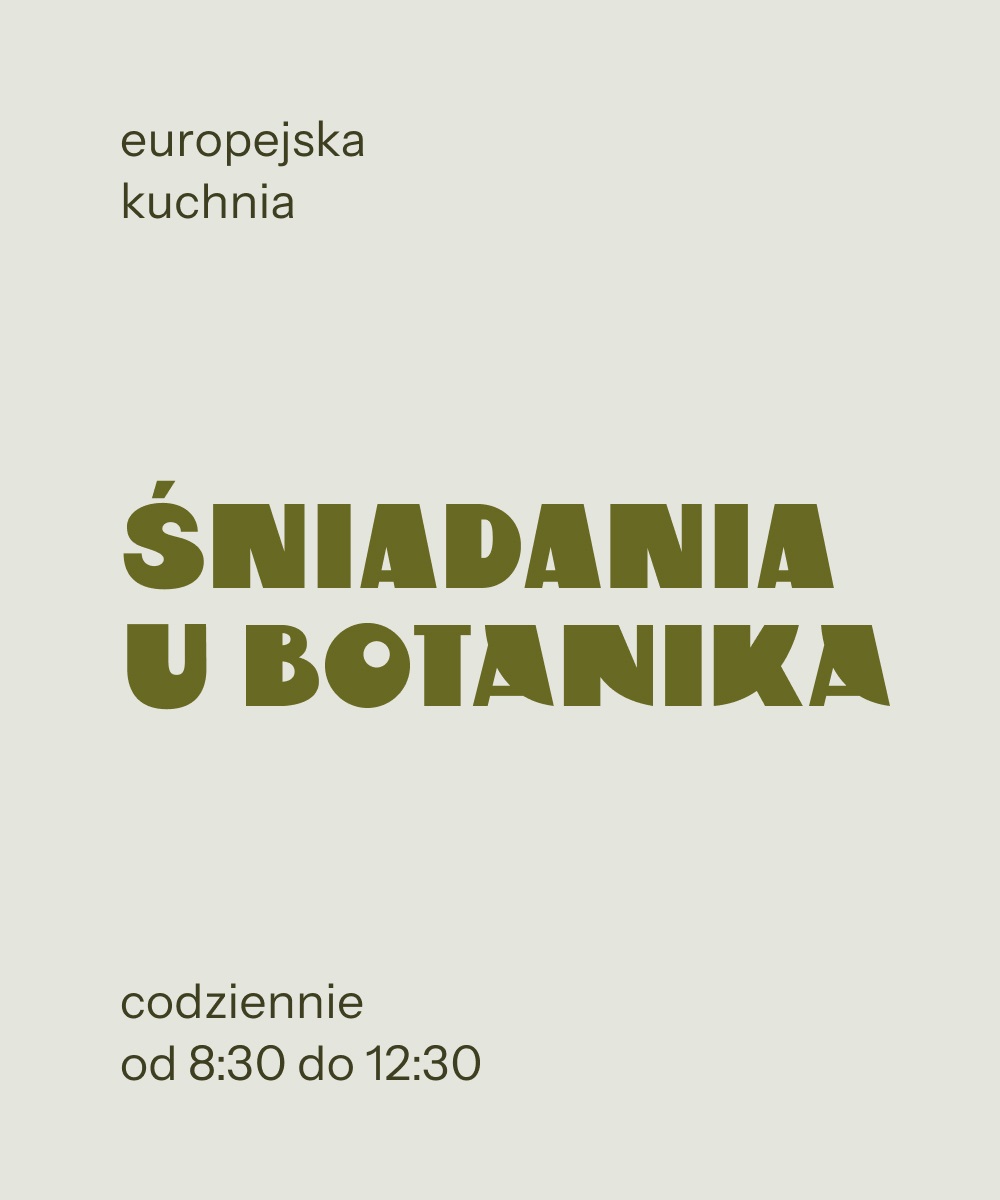
The main theme of Botanik is the omnipresent vegetation, which invites from the outside to visit the restaurant, relax and try the dishes. The branding and visual materials emphasize both the botanical character of the place and the art deco aesthetics, which is also visible in the interiors. The whole is maintained in a casual smart tone - elegant, but casual.
( + ) solution
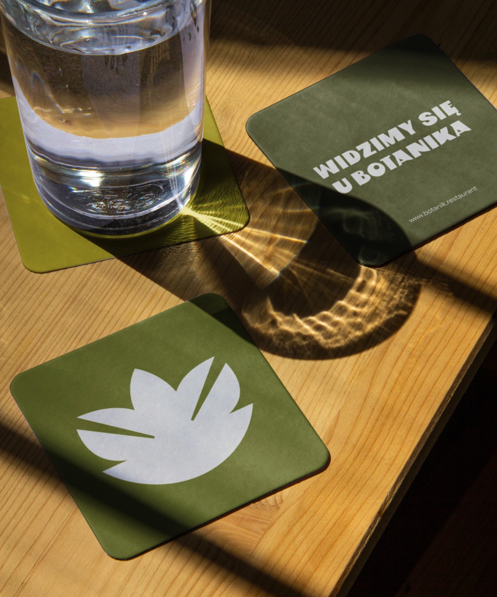
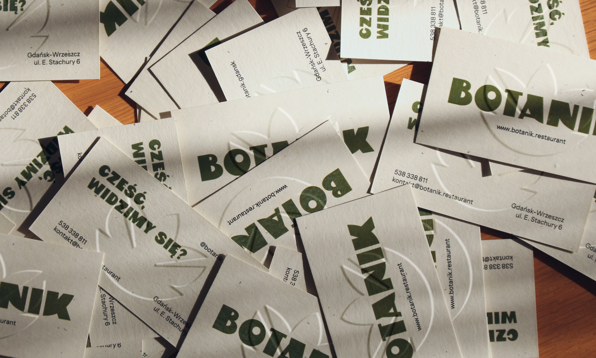
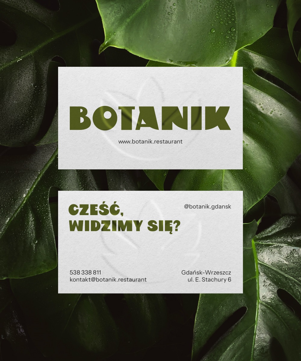
The name Botanik was chosen to suggest the plant-based nature of the restaurant – visible both in the interior design and in the approach to the dishes served. The brand's communication is loose, direct and based on the assumption that we already know each other, leading to the question "when will we meet" – that is why the slogan of the restaurant is "see you at the botanist's", and Botanik himself says "hello, see you?".
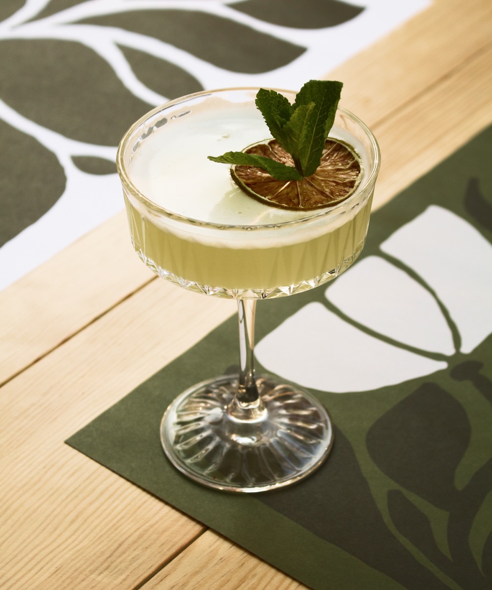
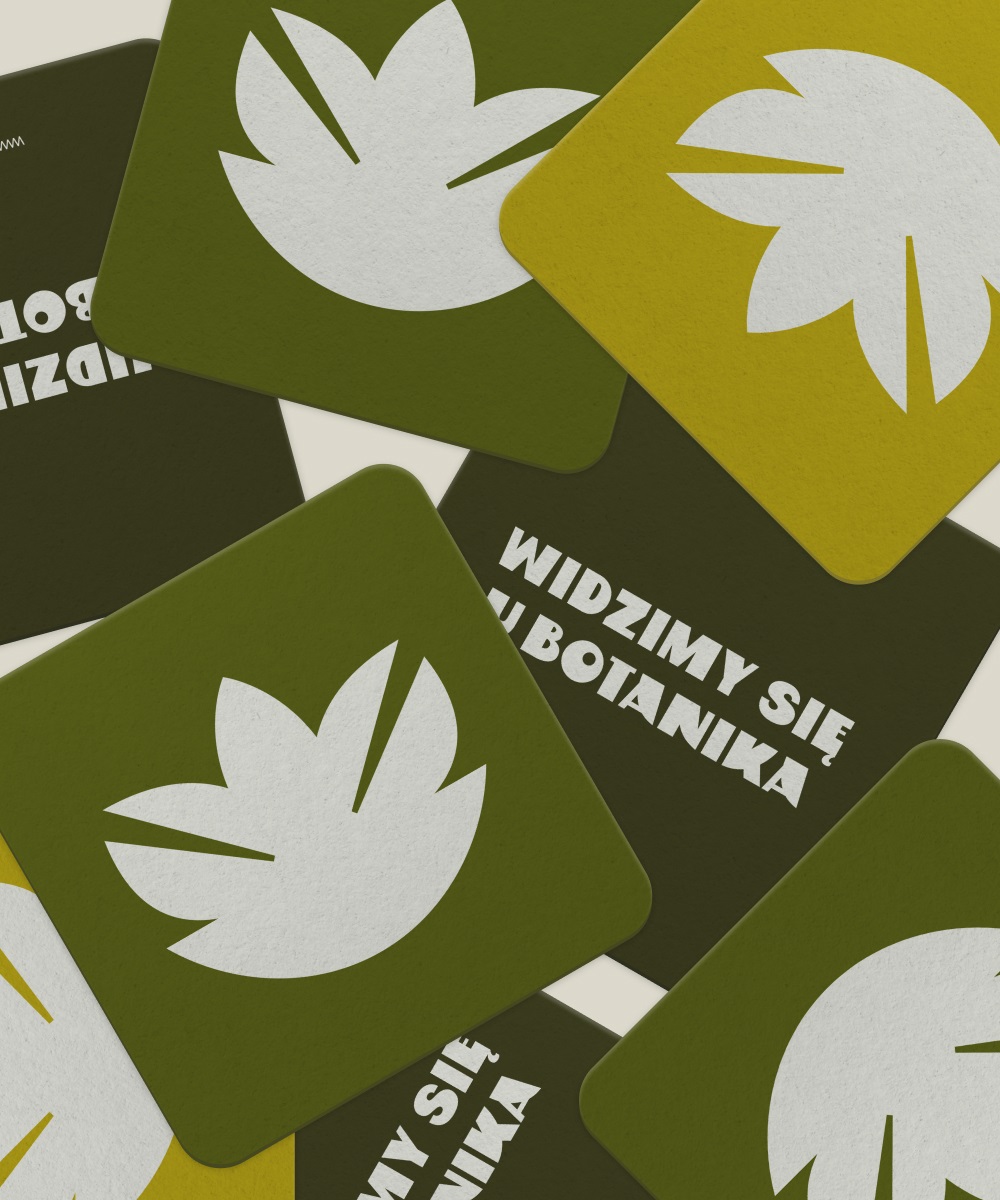
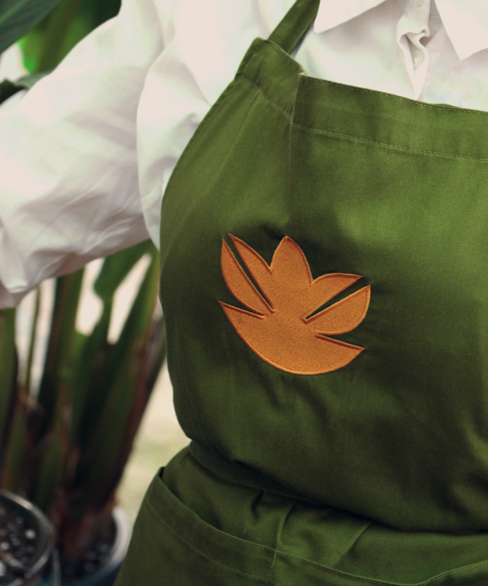
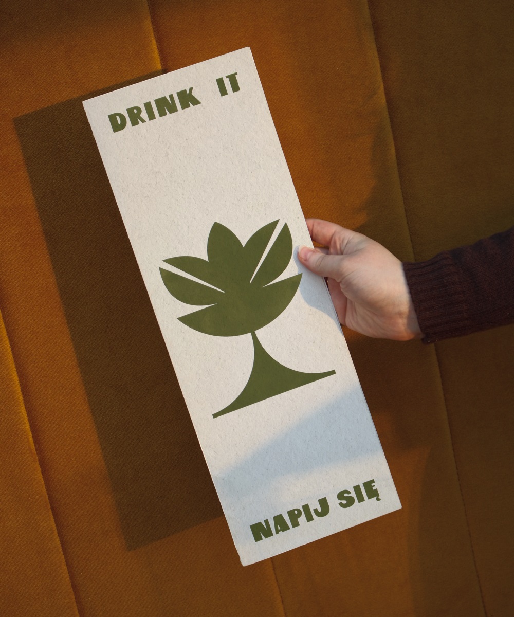
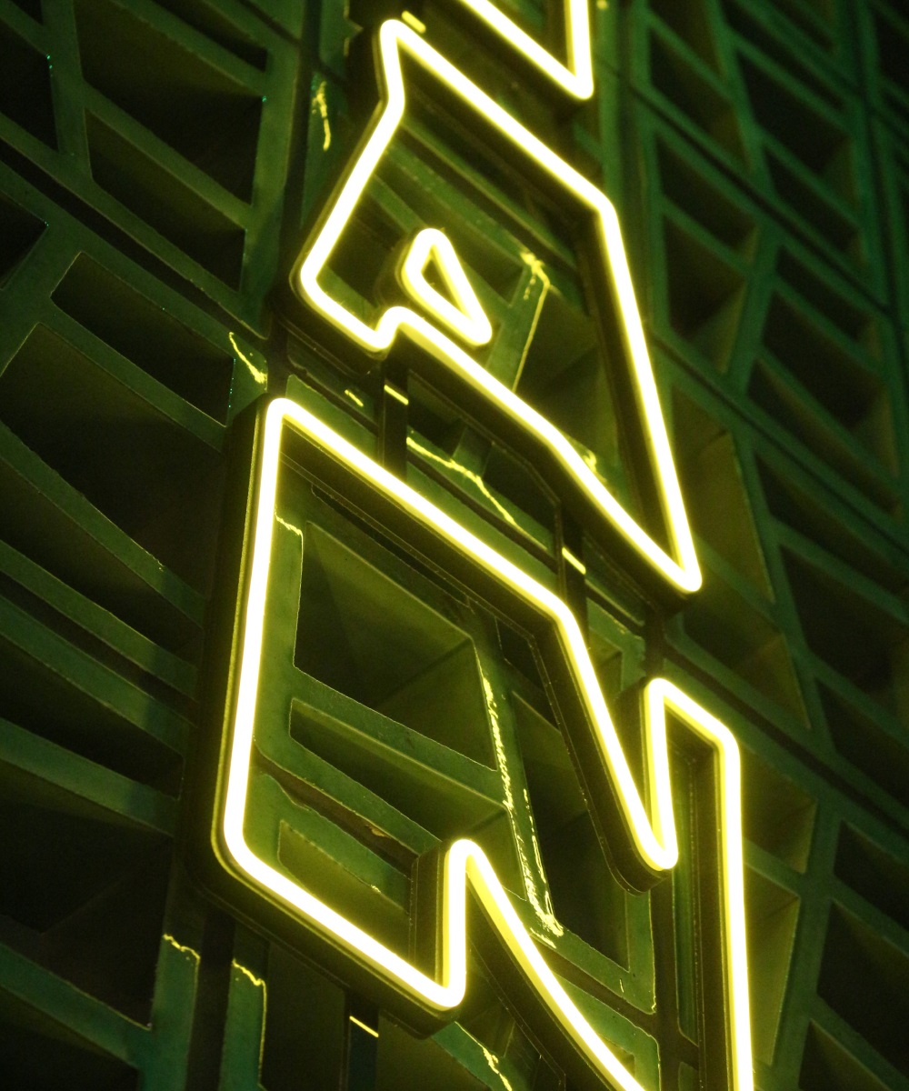
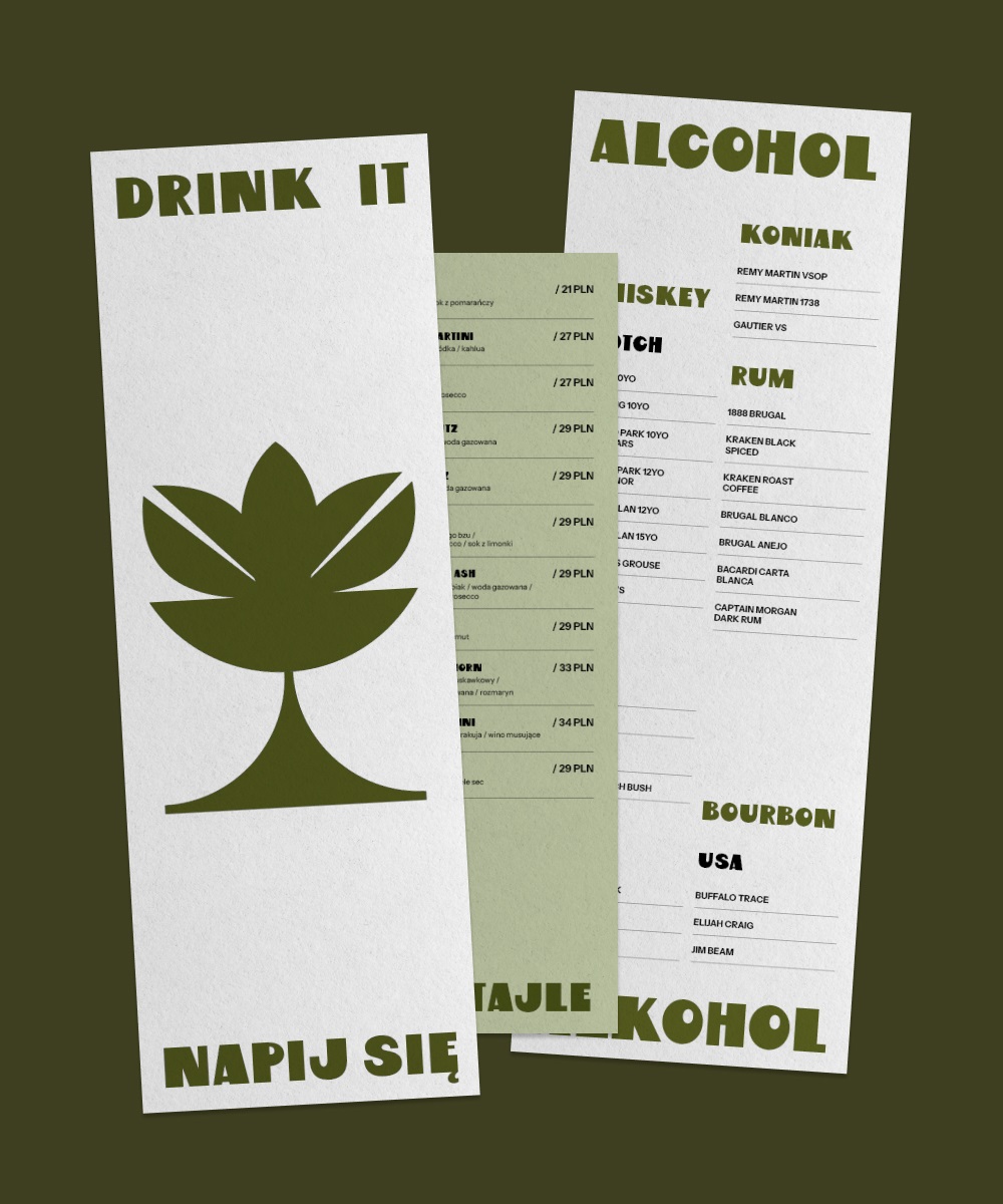
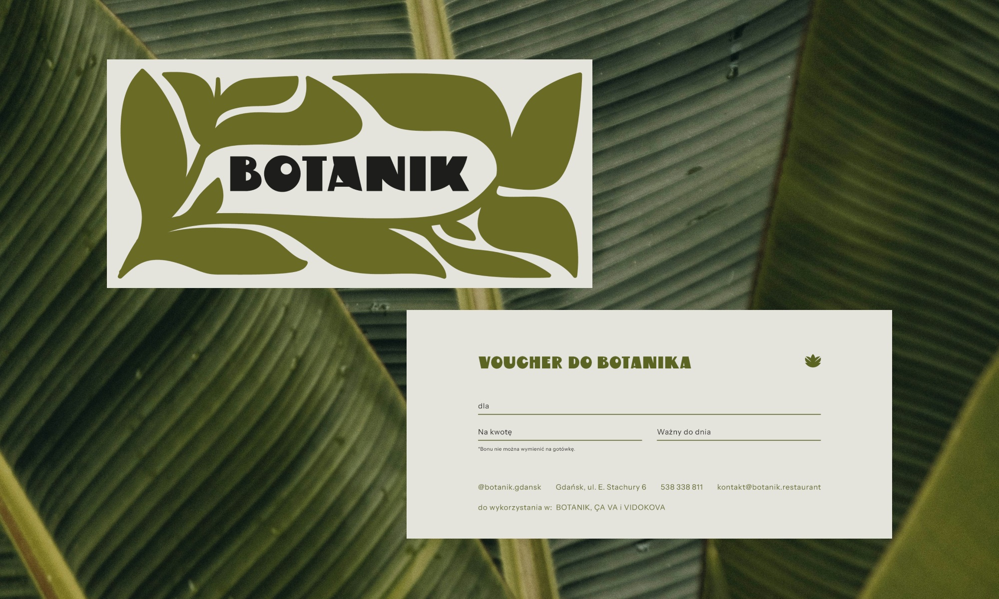
When we choosing the forms that appeared in the logo, on the visual identification materials and on the posters in the restaurant space - we referred to organicity combined with elegance. Visual additions complement the character of the interior full of plants. They directly present the name of the restaurant without the need to say "plants, botanist, orangery" - we know that we are at the botanist's.
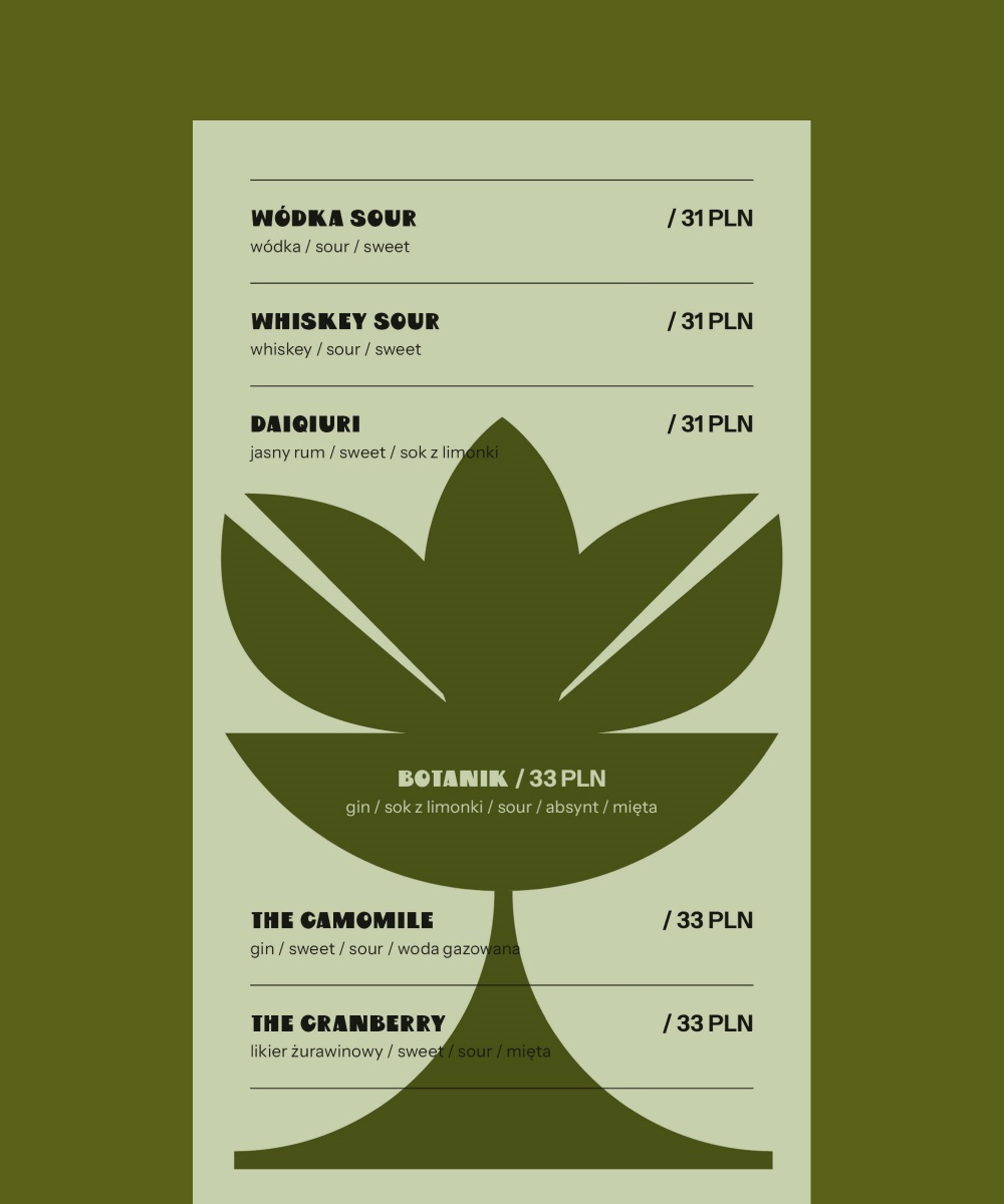
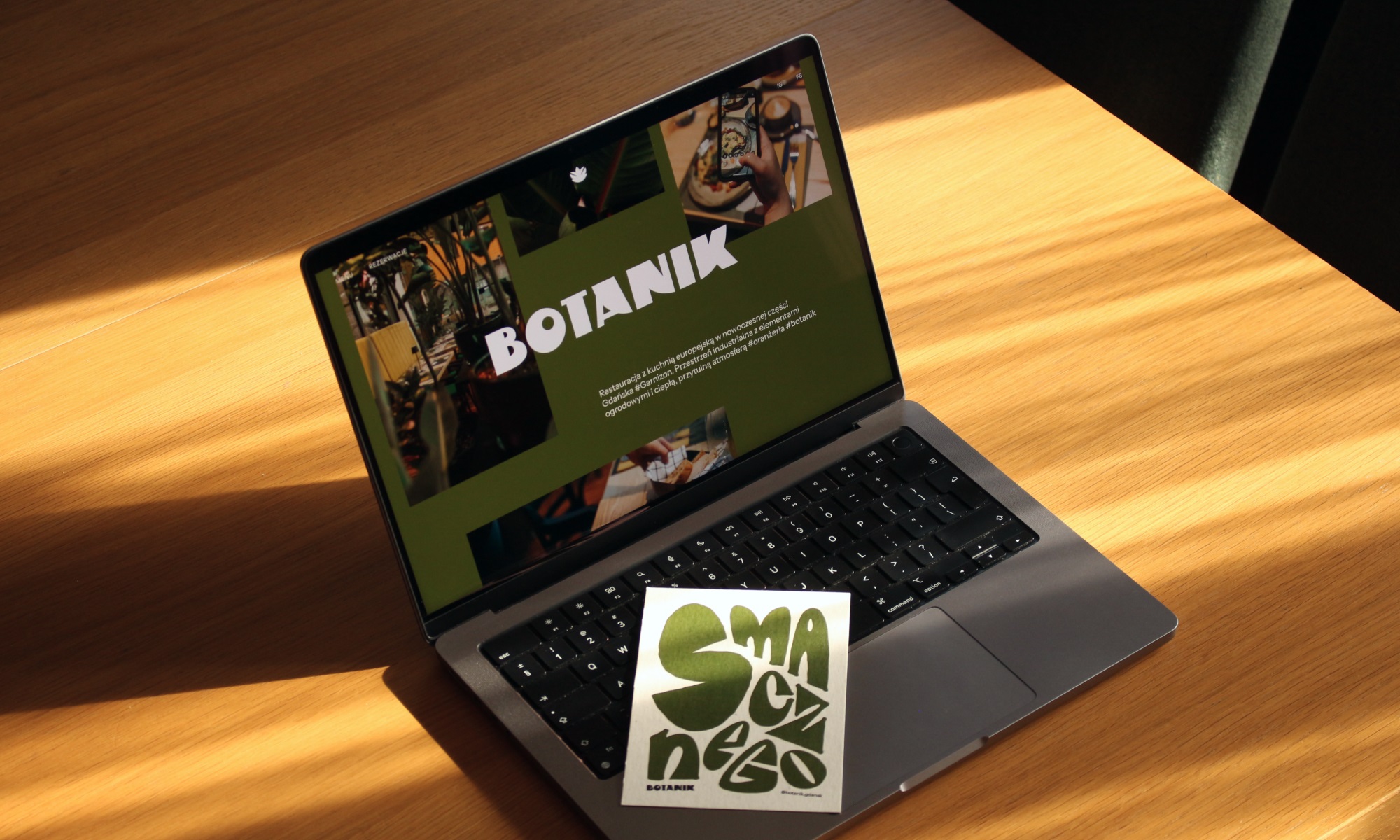
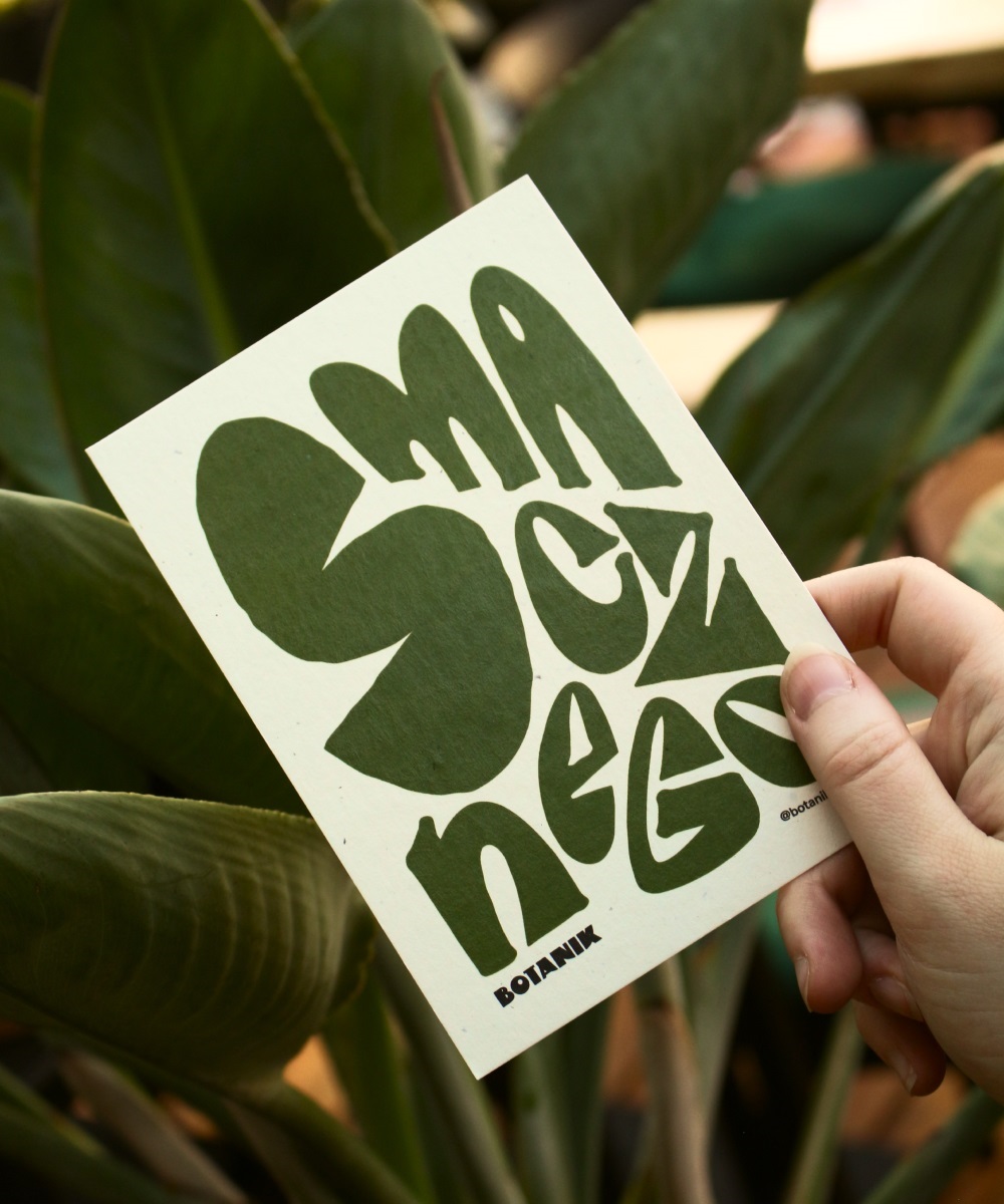
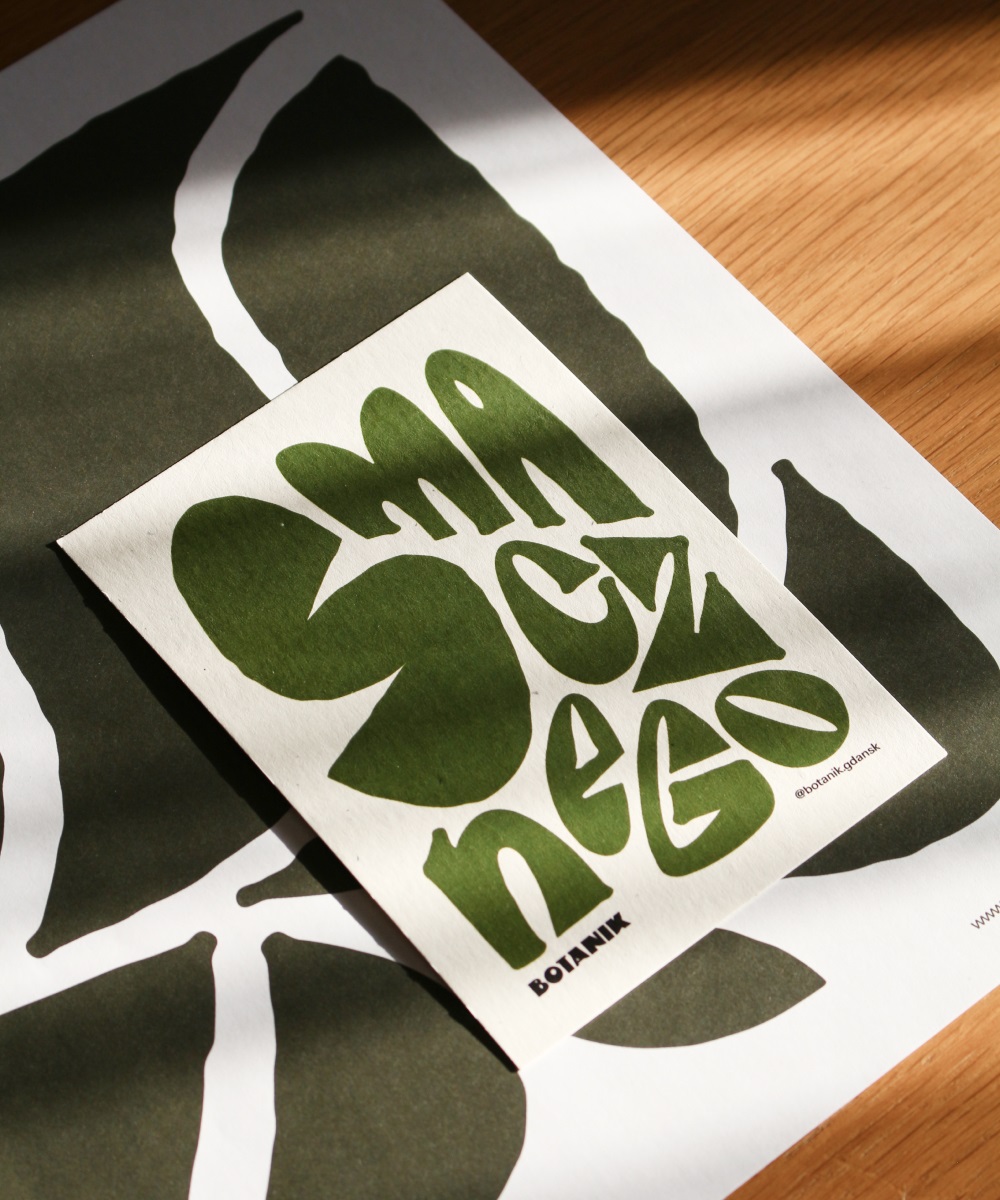
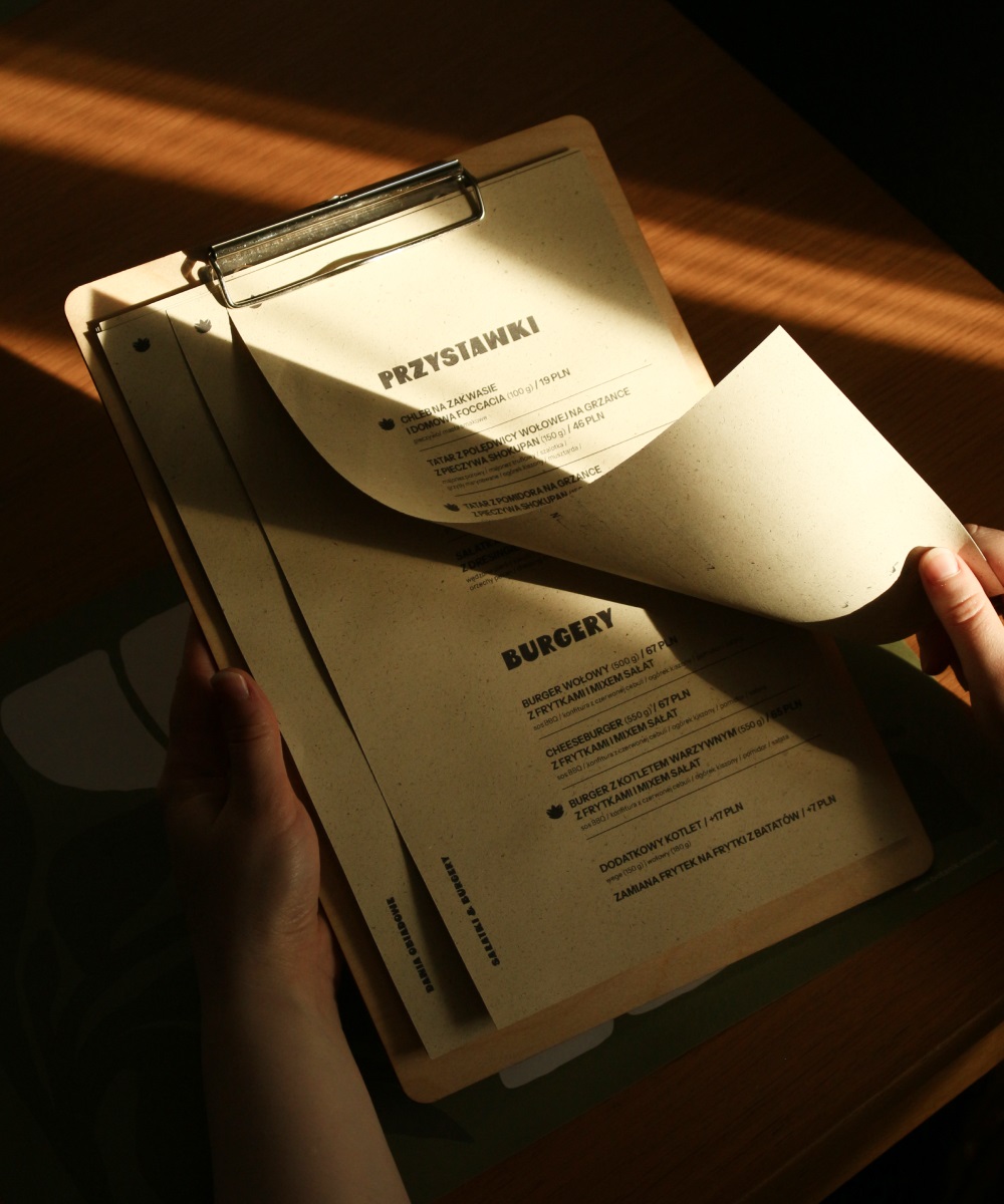
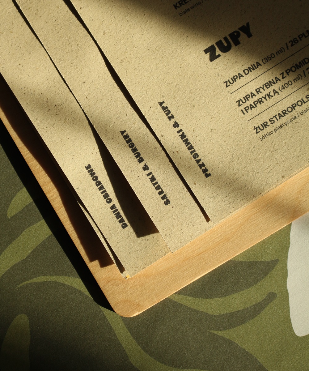
When we choosing materials for printing excerpts, we focused on papers that have a touch of nature in them. For business cards and postcards, we chose Flora paper, with characteristic colorful inclusions that give them a sense of connection with nature. The menu was printed on papers in various shades of green, with a predominance of Kazan paper containing grass fibers.

